Customer feedback
Which step hurts, in the customer's words, heard in support tickets, in-app feedback and calls.
- Volume
- ⟨about 60⟩ items
WorkEstimate and Invoice Revamp
The invoice and estimate flow Swivl's field-service businesses use to bill every job, redesigned in three rounds on customer feedback, sales-team feedback, PostHog recordings and usage numbers.
StatusLive · round 2.1 shipped June 2026
4 steps and a review page → 1 button
STEPS FROM "DONE" TO "SENT"
6 min 20 s → 2 min 10 s
AVERAGE TIME FROM NEW INVOICE TO SEND
none before round 2.1 → 38% of paid invoices
INVOICES PAID THROUGH THE PAY NOW LINK
~20 → ~34, held through the round 2.1 launch
INVOICES SENT PER WEEK
Safety metricAn office admin at a field-service business bills every finished job. In August 2025 our invoice was a four-step form. You saw the invoice only after the last step, line items sat in a nine-column table with one-line descriptions, there was no way to give a discount, and the job's costs lived in a separate calculator. Once sent, every invoice read "Open" until someone marked it paid, so an owner couldn't tell a waiting invoice from an overdue one. In August 2025, ⟨31%⟩ of the invoices people started were never sent.
We assumed an invoice was a form to fill in. ⟨Customer feedback and PostHog recordings⟩ showed owners treat it as two other things: the document their customer reads, and the money they are waiting for.
We put the document beside the form: the PDF updates as you type, and we added discounts, the job's costs and a choice of who pays the 3.5% card fee. In round 2.1, we turned the same page into a way to get paid. We put a Pay Now link on the PDF, moved Send and Take Payment into the footer, added part payments and instalments, and gave every invoice a status that shows where the money is.
Swivl is field-service software for small trade businesses: plumbers, HVAC and electrical contractors, roofers, landscapers, cleaners. Everything about a job lives in one app, from the first call to the payment. The office books the work, technicians do it on site, and the business quotes it with an estimate and bills it with an invoice.
creates and sends
bills on site
reviews
An estimate is the quote: the work, the price and the terms, sent to the customer to approve or to pay a deposit on. Once it's approved or the deposit is paid, the business turns it into an invoice with one click. The customer, line items, tax, terms and deposit all carry over, and the invoice goes out only when someone sends it.
Office admins billed a finished job through a four-step form, and only saw the invoice their customer would get at the very end. Once it went out, every invoice just said "Open", so owners couldn't tell who had paid, who was late or who to chase. This case study is about turning that form into one page where you build the invoice, send it and get paid.
4 steps
You only saw the invoice after all 4 steps. A wrong tax rate typed in step 2 meant going back and reopening that step.
0 discounts
There was no discount field, and the job's costs sat in a separate calculator.
0 pay links
The invoice couldn't collect money. A payment was only recorded in a dialog after it had already arrived.
1 status
Every sent invoice said "Open", so a waiting, a part-paid and an overdue invoice all looked the same.
time, errors, cash collected
activation, churn, upsell
demo objections, lost deals
Every round started from the same four inputs. Customer feedback named the pain, the sales team said what it cost in demos, the recordings showed where it happened, and the numbers showed how big it was. When the same problem turned up in at least ⟨5⟩ recordings and ⟨3⟩ tickets within a month, it was big enough to start a round.
Which step hurts, in the customer's words, heard in support tickets, in-app feedback and calls.
What comes up in demos and lost deals, heard in debriefs with the sales team.
Where people stall and what they do instead, seen in sessions filtered to the invoice builder.
How many, how long and how often, measured on the funnel from New invoice to Send.
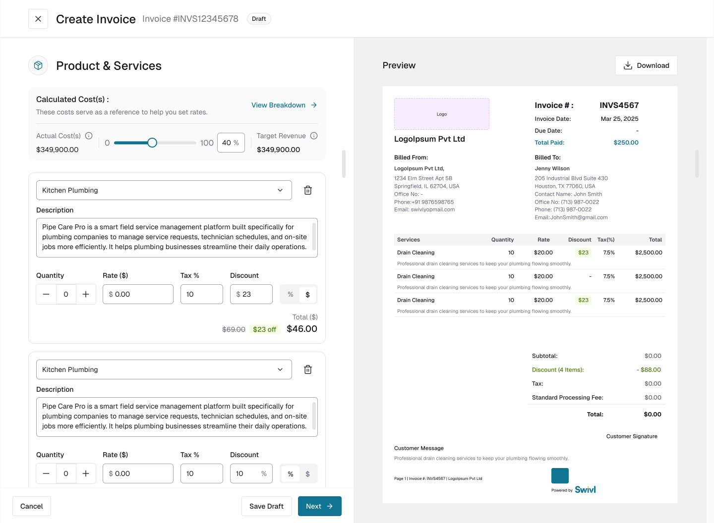
One full-screen page: the form on the left, the PDF on the right, updating as you type.
Why: the parts of an invoice depend on each other, and a discount on one line moves the total, the tax and the fee. Seeing it happen catches a mistake while it is cheap.
Cost: the preview takes half the screen and the form got narrower, so I checked the layout on a 2560 px screen and as one long scroll before committing.
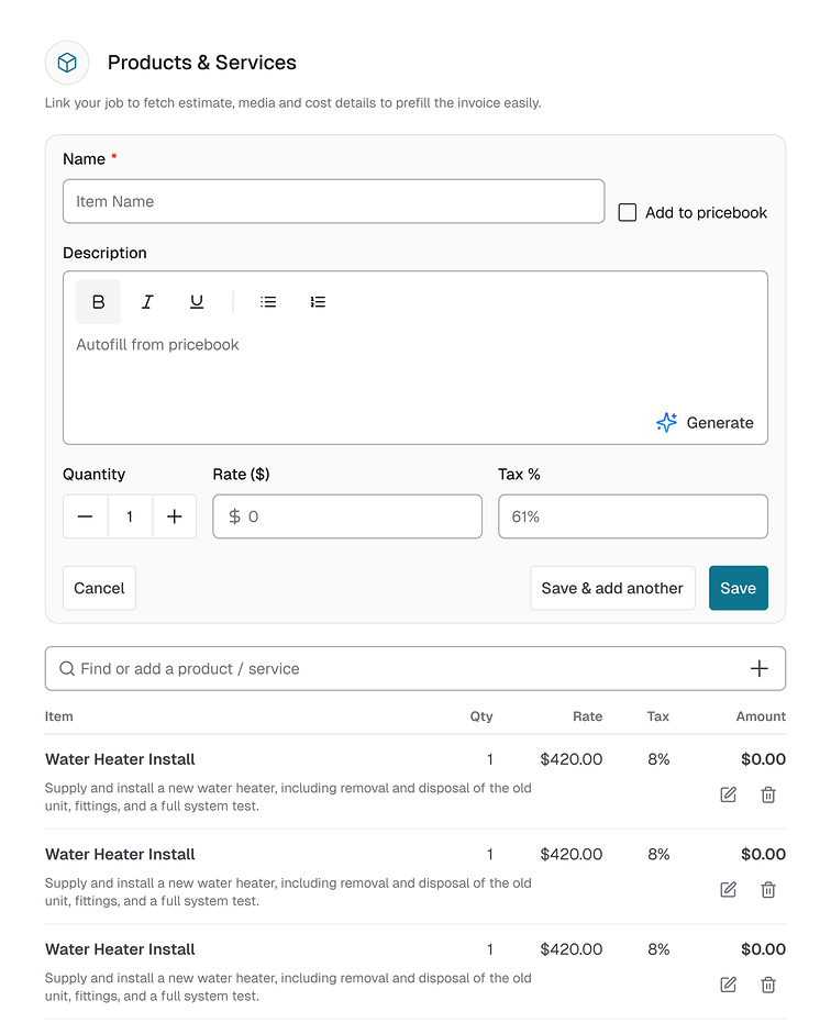
The item, its full description, a quantity stepper, rate, one Tax % field and a discount.
Why: people read an invoice line by line, and a card holds the whole description. One tax field replaced the switch and the percentage.
Cost: each card is about 360 px tall, so a 15-item invoice becomes about 5,400 px of form. Round 2.1 paid that back.
A discount on a line, in percent or dollars, shown as the old price struck through with "$23 off", and a discount on the whole invoice. The first time someone adds a line discount, a tooltip explains both: "Apply it per line item or once across the whole invoice after adding your products." After that it never shows again, on any invoice, session or device. I wrote nine rules for when it appears, down to "opens the field and types nothing".
Why: line and invoice discounts answer different conversations, a bundled job and a loyal customer.
Cost: two discount types to explain, and a rule set to keep in sync across sessions and devices.
A toggle decides who pays the 3.5% processing fee, with the consequence spelled out: "If you want customers to cover the platform fee, turn this on. If you leave it off, the fee is taken from your payout." The PDF shows it as its own Standard Processing Fee line, and the invoice page shows it in a banner.
Why: the fee changes either the customer's total or the business's payout, so the business should decide it knowingly.
Cost: one more decision on every invoice.
A deposit paid on an estimate carries into the invoice it becomes. For a deposit that never arrived, I designed the way back under the question "Deposit Not Received?": two methods, ⟨what each did and which one shipped⟩, and Undo Payment on the deposit-paid estimate, with a confirmation before it runs.
Why: a deposit marked paid by mistake breaks the balance on every document after it.
Cost: ⟨what the shipped method cost, and why you passed on the other⟩.
After saving, the invoice page listed the products with their discounts and tax, the customer and job, the terms and the estimate it came from, the cost breakdown, the fee banner and the attached media.
Why: the office needed every field of the invoice in one place.
Cost: the page stopped showing the document the customer received.
February 2026, on web: the full-screen builder with the live PDF, item cards, line and invoice discounts with the show-once tooltip, costs and markup in the form, the card-fee toggle, Import from Job for the job's photos and files, the deposit reversal, and the new invoice page.
Round 2 put the document in view. The next layer was the money: the form ended in Next, sending and payment lived on another page, and once an invoice went out, the business could only wait. ⟨The evidence that started round 2.1, and whether the push for Swivl Payments was part of it⟩.
The form footer reads: Cancel, the running total, Take Payment, Send. Send opens email or SMS in place, and a confirmation follows.
Why: once the invoice is right, the next move is sending it or getting paid, and both depend on the total.
Cost: four things share one footer on a laptop screen, and the less common send and payment options moved into dropdowns.
What I replaced: my own round 2 footer, which ended in Next.
One toggle puts a secure payment link on the PDF as a Pay Now button. The business can accept part payments, set fixed or flexible instalments, record a payment made without the link, and ask for a signature before payment: a five-step flow that ends with the card charged, the signature attached and a receipt emailed.
Why: the round 1 dialog recorded money after it arrived; these options go and collect it.
Cost: every option needed its own states, emails and receipts, from a partial-payment email and SMS to instalment tracking in the list.
Round 1's "Open" became three statuses: Awaiting Payment, Partially Paid, and Past Due with its date, next to Paid, Draft and Void. Each status has its own invoice page and its own actions.
Why: "Open" told the owner nothing about what to do.
Cost: six versions of the invoice page to design and keep consistent, on web and on mobile.
The page shows the document the customer received, with pages, zoom, print and download, and a side rail with the payment details (amount paid, payment due, the estimate it came from) and the job's costs.
Why: after sending, the owner asks two things: what did the customer get, and how much is left.
Cost: the round 2 data tables shrank to a side rail, and a long product list now reads inside the PDF.
The cost tool became Expense Manager, tagged Internal Only: "Track your labor, materials, and other costs to see the profit on this job." The invoice description carries the same tag. Optional fields moved into Additional options (work order number, customer notes, internal description, customer signature), each a toggle that asks before it deletes what was typed.
Why: once costs lived inside the form, the line between internal and customer-facing had to be visible.
Cost: optional fields sit one click deeper, and removing one takes a confirmation.
A Form / Preview switch hides the form and shows the PDF full width, and the PDF links the customer to the attached photos and documents. The invoice page exists on mobile web for every status, with actions in a bottom sheet.
Why: a three-page invoice needs full width to proofread, and the people on site carry phones.
Cost: two modes to switch between, and a mobile version of every status page to maintain.
June 2026, on web and mobile web: the new footer, the pay link and the payment options, six statuses with their own pages, the PDF-first invoice page, compact line items with tiers, a customer card and job import that prefill the invoice ("Link your job to fetch estimate, media and cost details to prefill the invoice easily"), Internal Only labels and Additional options, the Form / Preview switch, an instalments view in the list, and the mobile web invoice pages. Through August I kept tuning: Take Payment became Record Payment, Form / Preview became Default / Preview, the customer card gained an Edit action, and a bug-fix pass went through the form.
Average time from New invoice to Send went from ⟨3 min 25 s⟩ to 2 min 10 s. 38% of paid invoices came through the Pay Now link, and ⟨7%⟩ were paid in instalments.
One full-screen page: the form on the left and the PDF on the right, updating with every field, so a mistake shows up the moment you make it, while it's still cheap to fix. On a 1440 px screen the form gets 712 px and the PDF 726 px. I checked it on a 2560 px screen and as one long scroll before committing.
Ideas I dropped: ⟨the options you tried first, for example a preview panel inside the steps⟩. The trade-off: the form lost half its width, so every field had to work in a narrower column.
A toggle on each invoice lets the business choose, with the consequence in plain words: "If you want customers to cover the platform fee, turn this on. If you leave it off, the fee is taken from your payout." The PDF shows the fee as its own line. In round 2.1 the invoice page also names the payer: "⟨Customer⟩ is covering the 3.5% standard processing fee."
Ideas I dropped: ⟨for example one account-wide setting, or always passing the fee on⟩. The trade-off: one more decision on every invoice, and a total that changes with it.
Once the invoice is right, the next step is sending it or getting paid, and both depend on the total. So the footer now holds Cancel, the running total, Take Payment and Send. Send opens email or SMS in place, and the less common options sit in the dropdowns. On the PDF, one toggle adds a Pay Now link. After release, Take Payment became Record Payment.
Ideas I dropped: ⟨for example keeping a review step before sending⟩. The trade-off: four controls in one footer at laptop width, and I threw out my own round 2 footer four months after it shipped.
Six statuses that say where the money is: Awaiting Payment, Partially Paid and Past Due (with its date), next to Paid, Draft and Void. Each has its own invoice page and action menu, on web and mobile web, so the status also tells the owner what to do next.
Ideas I dropped: ⟨for example one Unpaid status with a due-date badge⟩. The trade-off: six versions of the invoice page and six action menus to keep consistent.
What if…?
What if…?
What if…?
What if…?
One card per line item (Revamp 1, decision 2)
What we assumed
People read an invoice line by line, so each item deserved a card: its full description, a quantity stepper, rate, one tax field and a discount.
What users experienced
⟨What the recordings or feedback showed⟩. In the round 2 designs, each card is about 360 px tall, so a 15-item invoice runs to about 5,400 px of form.
Why we killed it
The idea was only half right. People do read line by line, but they don't need every line open as a full editor at once. The card made one line easy to read and the whole invoice hard to get through. The more items there were, the longer the scroll.
What replaced it (round 2.1)
Rows about 85 px tall, with one inline editor open at a time. The same 15 items now take about 1,275 px, plus the one line you're editing.
Passing the 3.5% card fee to every customer by default
The ask: The sales team wanted the 3.5% card fee added to the customer's total on every invoice, by default. In demos, owners kept asking why they should lose 3.5% of each payment, and a default looked like the quickest answer.
What I argued: A default changes the customer's total without the owner ever choosing it. A customer who approved an estimate at one price would get an invoice asking for more, and the PDF would no longer match what they agreed to. So I argued for a switch on each invoice, with what it does written right next to it. I showed both versions to ⟨5⟩ owners on sales calls, and ⟨4⟩ of them wanted to decide job by job.
How it ended: We shipped the switch on each invoice, with the consequence in plain words and the fee as its own line on the PDF. Sales got a one-click way to pass the fee on, and since round 2.1 the invoice page says who is covering it, which is easy to show in a demo. We also started tracking how many invoices pass the fee on. It's a row in the Impact table.
Round 1 · August 2025
Four-step accordion, Save and Next on each step
Round 2.1 · June 2026
One page, the form beside the live PDF, Send in the footer
Four steps and a review page became one page. Average time from New invoice to Send: 6 min 20 s → 2 min 10 s
Round 1 · August 2025
Nine columns, one-line descriptions, ten rows a page
Round 2.1 · June 2026
Rows about 85 px tall, the tier on the line, one editor open
The round 2 cards in between ran about 360 px each. At about 85 px a row, 15 items take about 1,275 px instead of 5,400
Round 1 · August 2025
Send on the review page
Round 2.1 · June 2026
Send ▾ beside the total
Started invoices that get sent: ⟨69%⟩ → ⟨86%⟩
Round 1 · August 2025
One dialog: online or cash, deposit, note, signature or stamp
Round 2.1 · June 2026
Pay Now on the PDF, part payments, instalments, sign then pay
Invoices paid through the Pay Now link: none → 38% of paid invoices
Round 1 · August 2025
The list with Paid, Open and Draft totals
Round 2.1 · June 2026
Six statuses, and a PDF-first invoice page with payment details
Days from sent to paid: ⟨21⟩ → ⟨12⟩
The headline number is the time from New invoice to Send, 6 min 20 s on average in August 2025 and 2 min 10 s in June 2026. It moved more than anything else across the three rounds. Round 1 is the earliest version I have screens for, so it is the baseline.
| Metric | Feb 2026 · round 2 | June 2026 · round 2.1 | Source |
|---|---|---|---|
| Average time from New invoice to Send | ⟨3 min 25 s⟩ | 2 min 10 s | PostHog funnel |
| Started invoices that get sent | ⟨78%⟩ | ⟨86%⟩ | PostHog funnel |
| Invoices with a discount | ⟨14% of invoices⟩ | ⟨23% of invoices⟩ | Billing data |
| Invoices where the customer covers the card fee | ⟨29% of invoices⟩ | ⟨34% of invoices⟩ | Payments data |
| Invoices paid through the Pay Now link | no link | 38% of paid invoices | Payments data |
| Invoices paid in instalments | no instalments | ⟨7% of paid invoices⟩ | Payments data |
| Days from sent to paid | ⟨20 days⟩ | ⟨12 days⟩ | Billing data |
| Invoicing support tickets per month | ⟨14⟩ | ⟨9⟩ | Support tool |
| Invoices sent per week (safety) | ~20 a week (May 2026) | ~34 a week (Sep 2026) | PostHog |
THE SAFETY METRIC. Invoices sent per week held at about 20 through the round 2.1 release, then rose to about 34 by September 2026, in a flow businesses bill through every day.