Draft for review⟨ ⟩ sample number to replace · –⟨ ⟩ detail to add or confirm · –15 visuals planned, 10 to make first
Swivl
Product Designer
2025 to 2026
Cut design time by 50% and made a six-week product revamp possible.
New screens now take 50% less time to design, and 70% of them are built only from library parts.
Swivl is a field service platform. Office teams run jobs, estimates, invoices and schedules on desktop, and technicians use it on their phones. In June 2025, three of us started building the design system behind every one of those screens: the parts in Figma, the rules in Notion, and the same scales the code uses. This is the story of what we decided, and what it changed.
Swivl is a field service platform. Office teams run jobs, estimates, invoices and schedules on desktop, and technicians use it on their phones. Three of us built the design system behind every screen: the parts in Figma, the rules in Notion, and the same scales the code uses.
Metric
50%
Less time to design a new screen
Was about 30 min, now about 15 min
1–2
Design QA issues per feature
Down from double digits
70%
New screens built only from library parts
Up from about 40%
95%
Colours on core components come from tokens
Counted on 12 core component pages
Voice noteAbhi walks you through it
0:00 / 1:30
V28Hero · Popover redlinesNewBuilt in code7.5 s · loops
Send a payment reminder?Maple Plumbing gets an email and a text.
ShowThe real Popover at its real spec, 512 wide. Red size lines, the magenta 2px title gap, blue spacing guides with token chips, then radius, border and shadow, each appearing in turn like Figma's inspect, then fading before the loop.SourcePopover component set (read only); every value checked against the Theme file.
V01Hero videoMustVideo loop · 12–15 s · 16:10
+ Create jobScheduledFilterJobsTasksNotesMore ▾
Light
Dark
ShowA real Jobs screen lifts into its parts, snaps back, then flips to dark mode and ends on the first frame.SourceComponent Lib and a live screen
Role
Product Designer 2
Team
Victoria, lead Aashish and me
Timeline
Jun 2025 – Jun 2026
Platforms
Web and mobile web Light and dark
Tools
Figma variables Notion, Linear
Role
Product Designer: foundations, component docs, the pop-up rule and its code audit
Team
Victoria (Lead Product Designer), Aashish (Product Designer), me
Timeline
Jun 2025 – Jun 2026
Platforms
Web and mobile web, light and dark
Tools
Figma variables, Notion, Linear
Impact on our workflow
50%
Less time to design a new screen
1–2
Design QA issues per feature, down from double digits
70%
New screens built only from library parts, up from about 40%
95%
Colours on core components come from tokens
97.7%
Colour bindings on the top tier
93
Components in Storybook on every push
5
Named pop-up sizes, down from about ten
95%
Colours on core components come from tokens
⟨42%⟩
Less time to design a new screen
⟨57%⟩
Fewer design QA issues per feature
⟨85%⟩
New screens built from library parts
95%
Colours on core components come from tokens
⟨42%⟩
less time to design a new screen
⟨57%⟩
fewer design QA issues per feature
⟨85%⟩
of new screens built from library parts
95%
of colours on core components come from tokens
The 30-second version
The challenge
Swivl had grown fast, and nothing was written down. Designers copied hex codes from old frames, and the same job got a different answer depending on who drew it. Then the ask landed: revamp the whole product and ship a run of big new features, on a deadline counted in weeks, not months.
What we did
We built the system first, so every part made once would serve the revamp and every feature after it. Colours sit in three layers, so a rebrand or dark mode is one change, and one rule with five named sizes replaced about ten pop-up widths. The revamp took six weeks.
The key insight
We didn't need more components. We needed decisions: which button, which pop-up, which colour, and why. A design system is a decision system, not a component library.
My role
Product Designer 2, one of three designers on the system, June 2025 to June 2026
Foundations: colour, type, spacing, icons and illustration
Component docs, the pop-up rule and its code audit
The audit after v1: all 79 library pages checked against the docs
The team
Victoria, Lead Product Designer
Aashish, Product Designer
The Swivl engineering team
The constraints
3 designers, 15+ modules
Feature work couldn't stop while we built the system.
Tailwind and shadcn/ui
Engineers already built with both.
Desktop and phone
Every screen had to work on a phone.
Why we needed it
Swivl added modules fast: jobs, estimates, invoices, scheduling, inventory and AI features. The design rules didn't keep up. Nothing was written down, so designers copied hex codes from old frames and guessed icon sizes. Six button styles did three jobs, and pop-ups came in about ten widths.
V02Before collageMustImage or a slow 8 s pan
6 button styles doing 3 jobs
SaveSaveSaveSaveSaveSave
Pop-ups from 280 to 650px wide
280650
Colours copied by hand from old frames
ShowThe six old button styles, pop-ups of different widths, and a hand-copied hex code, each with a small tag.Sourcedeprecated parts in the Buttons frame
Constraints
3 designers, 15+ modules
Feature work couldn't stop while we built the system.
Tailwind and shadcn/ui
Engineers already built with both.
Desktop and phone
Every screen had to work on a phone.
The unexpected challenge
Swivl had grown fast. Jobs, estimates, invoices, scheduling, inventory, then the AI features, and each module was designed a little differently from the last, because nothing was written down. Designers copied hex codes from old frames and guessed icon sizes. Pop-ups came in about ten widths. The same job got a different answer depending on who drew it.
Then the ask landed: revamp the whole product, ship a run of big new features on top of it, and keep every screen working on a technician's phone, all on a deadline counted in weeks, not months. Three designers. And the feature work already on our plates could not stop.
It felt like a chicken-and-egg problem:
Keep shipping on the old UI, and redraw all of it later? Or build the new UI first, and let the roadmap wait while we did?
We took a third path. Build the system first, and let it carry both. Every part made once would serve the revamp and every feature after it. The rest of this page is what that took.
The unexpected challenge
Swivl had grown fast. Jobs, estimates, invoices, scheduling, inventory, then the AI features, and each module was designed a little differently from the last, because nothing was written down. Designers copied hex codes from old frames and guessed icon sizes. Pop-ups came in about ten widths. The same job got a different answer depending on who drew it.
Then the ask landed: revamp the whole product, ship a run of big new features on top of it, and keep every screen working on a technician's phone, all on a deadline counted in weeks, not months. Three designers. And the feature work already on our plates could not stop.
It felt like a chicken-and-egg problem:
Keep shipping on the old UI, and redraw all of it later? Or build the new UI first, and let the roadmap wait while we did?
We took a third path. Build the system first, and let it carry both. Every part made once would serve the revamp and every feature after it. The rest of this page is what that took.
Then the ask changed. Swivl wanted a full product revamp, a run of big new features, and every screen working on a technician's phone, all inside ⟨2–3 months⟩. There were three of us to design it, and the feature work already on our plates could not stop.
Do we keep shipping features on the old UI and redesign them later? Or build the new UI first, knowing every feature drawn on the old one would have to be drawn twice?
We took a third path. Build the system first, and let it carry both.
The whole system at a glance
One picture of the whole story before the detail. Read it top to bottom: why we needed a system (modules grew fast, the rules were never written down, and the same job got different answers), the six principles behind every call, the insight that changed how we worked, and then what we built: foundations, components, the pop-up rule, docs and rollout, ending in the result. The band at the bottom is what happened after launch.
One map, the whole story. The two numbered boxes are the decisions everything else hangs on. Decision 1 puts every colour in three tiers, so a rebrand or dark mode is one change instead of a redraw. Decision 2 swaps about ten pop-up widths for one rule and five named sizes. If you read only two things on this page, read those.
The two numbered boxes are the key decisions. Decision 1 puts every colour in three tiers, so a rebrand or dark mode is one change instead of a redraw. Decision 2 replaces about ten pop-up widths with one rule and five named sizes. Most of what follows on this page comes from those two.
V00Bird's-eye mapNewBuilt in codeLive text · scales to the column
1Key decision⟨ ⟩Sample number to replace
Why we needed it
Modules grew fastJobs, estimates, invoices, scheduling, AI
Rules weren't written downHex codes copied from old frames
Same job, different answersAbout ten pop-up widths
Six principles
ScalableBuilt for 10× the data
FamiliarNamed the same as the code
ReusableA variant, not a new part
Mobile-firstA phone version of every part
Good enoughShip, then improve
AI-assistedAI checks, people decide
The insightA design system is a decision system
Foundations
Name every colour by its jobPrimary, card, warning, not shades
1Three-tier alias chain
Same scales as the codeSpacing 4 in Figma is p-4 in code
Mode · light and darkTheme · brand coloursTailwindCSS · raw palette
73 colours. Screens use only Mode.
Components set up, not detachedButton: 36 variants · Popover: a native slot
Built on familiar toolsTailwind CSS, shadcn/ui, Lucide, Geist, Untitled UI Pro
2One rule for which pop-up to useAbout 10 widths → 5 named sizes
Notion explains when and whyOne page format, a changelog for every change
Old parts retire gentlyDeprecated tag and a short swap guide
The result
One set of rules for every Swivl screen
50% less time per new screen · 95% of colours come from tokens
Why we needed it
Six principles
Foundations
After launch
1Key decision
Modules grew fastJobs, estimates, invoices, scheduling, AI
Rules weren't written downHex codes copied from old frames
Same job, different answersAbout ten pop-up widths
ScalableBuilt for 10× the data
FamiliarNamed the same as the code
ReusableA variant, not a new part
Mobile-firstA phone version of every part
Good enoughShip, then improve
AI-assistedAI checks, people decide
Name every colour by its jobPrimary, card, warning, not shades
1Three-tier alias chainMode · light and darkTheme · brand coloursTailwindCSS · raw palette73 colours. Screens use only Mode.
Same scales as the codeSpacing 4 in Figma is p-4 in code
Components set up, not detachedButton: 36 variants · Popover: a native slot
Built on familiar toolsTailwind CSS, shadcn/ui, Lucide, Geist, Untitled UI Pro
2One rule for which pop-up to useAbout 10 widths → 5 named sizes
Notion explains when and whyOne page format, a changelog for every change
Old parts retire gentlyDeprecated tag and a short swap guide
The insightA design system is a decision system
The resultOne set of rules for every Swivl screen50% less time per new screen · 95% of colours come from tokens
Audit after v1 · all 79 Figma pages
5 gaps found
3 decisions · red delete buttons, one modal scale, one status colour map
ShowThe map first, then the page walks through it in the same order.NoteThe 50% in "The result" is the same figure as in the hero and in What changed.
What we started with
Before the system, we listed what already existed in Figma and in code. In our own words at the time, designers "were referring directly to Figma for values without naming or usage guidance", and icon sizes were a guess.
V03Audit boardNiceImage
~116button variants: 6 styles × 4 sizes
394one-off widths in code, next to 121 named ones
14record forms in centred pop-ups, 5 of them for customers
20illustrations missing, next to 31 in use
ShowThe old parts grouped by type, with the four counts as large labels.Sourceyour audit page in Figma and the Overlays audit in Notion
The insight
We didn't need more components. We needed decisions: which button, which pop-up, which colour, and why.
A design system is a decision system, not a component library.
The principles behind every decision
With three designers and no time to argue, we needed a way to say no quickly. So before we drew a single component, we agreed on four principles. Every decision on this page traces back to them, and they are the reason two of us, working alone, reach the same answer.
Every decision in the system traces back to Swivl's design principles. They let three people say no quickly, and they're why two designers reach the same answer on their own.
V27Three principlesMustCoded · 3 rows · 15 s loop
Scalable
Design for scale, not for today
Search
3 items8 rows, then scroll
Familiar and reusable
Reuse instead of reinventing
Save
+ New IconButton
Button
VariantPrimary
Icon only
<Button size="icon" />
AI-assisted
AI speeds up thinking, people decide
AI review2 suggestions
Use the primary token, not #0E7490
Applied
Make a new component for this
Dismissed
ShowScalable: a menu stops at 8 rows, then scrolls and gets a search. Familiar and reusable: instead of a new IconButton, icon only becomes a switch on the Button. AI-assisted: AI suggests two changes, and the designer accepts one and dismisses the other.
V27Four principlesMustCoded film · 6 chapters · about 46 s
A short film about the four principles. With three designers and no time to argue, every decision goes through four filters. One request, adding “Assign technician” to the job page, on phones too, drops through them. Scalable reshapes the menu: it scrolls after 8 items and adds search. Familiar and reusable stops a new IconButton component: icon-only is a switch on the Button. Mobile-first turns the menu into a bottom sheet with 44px touch targets. AI-assisted: AI suggests three changes and a designer keeps two and turns one down. Then two designers, working alone, reach the same answer.
01ScalableDesign for scale, not for today
01Scalable
02Familiar and reusableReuse instead of reinventing
02Familiar and reusable
03Mobile-firstSmallest screen first
03Mobile-first
04AI-assistedAI speeds up thinking, people decide
04AI-assisted
Request
Add “Assign technician” to the job page.On phones too.
PMProduct manager
Job #1042Technicians 410×
Assign technician
Job #1042Technicians 4010×
Assign technician
Search technicians
Job #1042on phones
Buttonlibrary part
Icon only
CODE<Buttonsize="icon" />
Search technicians
Assign technician
Cancel
Assign technician
Cancel
1280px
Search8 rows
New component?IconButton
44px
AI review · suggestions
Add a focus state
Designer: yes
Focus state added
Make Cancel red?
Designer: no, red means delete
Draft the docs
Designer: kept, after a read
Docs draft kept
Three designers.
No time to argue.
Before we drew a single component, we agreed on four principles.
Every decision goes through all four.
01 / 04
Scalable
Design for scale, not for today
Test
What if there were 10× more?
Reshaped
Menus scroll after 8 items and add search for long lists.
02 / 04
Familiar and reusable
Reuse instead of reinventing
Test
A new need: icon-only on phones. Build a new component?
No new component
A new need becomes a variant: icon-only is a switch on the Button.
03 / 04
Mobile-first
Smallest screen first
Test
Does it work at 360px first?
Reshaped
Menus become bottom sheets, with 44px touch targets.
04 / 04
AI-assisted
AI speeds up thinking, people decide
Test
AI reviews it. Who makes the call?
A designer decided
AI checks and drafts; a designer makes every call.
Two of us, working alone.
ADesigner A
01
02
03
04
REQUEST
BDesigner B
01
02
03
04
REQUEST
The same answer.
01
Scalable
Menus scroll after 8 items and add search for long lists.
02
Familiar and reusable
A new need becomes a variant: icon-only is a switch on the Button.
03
Mobile-first
Menus become bottom sheets, with 44px touch targets.
04
AI-assisted
AI checks and drafts; a designer makes every call.
Designer A = Designer B
0:00 / 0:46
ShowOne request drops through the four principles. Each one reshapes it, stops it or hands the call to a designer, and two designers working alone reach the same answer.
V27Four principlesNewBuilt in code9 s · loops
01Scalable
02Familiar and reusable
03Mobile-first
04AI-assisted
ShowThe four principles rise one by one, the links between them draw in and click together, and a pulse runs through. Drawn in code in the style of Abhi's reference.
01
Scalable
Design for scale, not for today
Built for 10× the data: menus scroll after 8 items and add search for long lists.
What it means
Every part has to survive 10× the data: long names, many options, empty and error states.
Where it shows
Menus scroll after 8 items and add search for long lists.
02
Familiar and reusable
Reuse instead of reinventing
Built on Tailwind scales and shadcn/ui parts, named the same as the code. A new need becomes a variant, not a new component: icon-only is a switch on the Button.
02
Familiar
Reuse instead of reinventing
Built on Tailwind scales and shadcn/ui parts, named the same as the code.
What it means
Start from patterns that users and engineers already know.
Where it shows
Built on Tailwind scales and shadcn/ui parts, with names that match the code.
03
Reusable
Systems, not one-offs
A new need becomes a variant, not a new component: icon-only is a switch on the Button.
What it means
A new need becomes a variant or a rule, not a new component.
Where it shows
Six button styles became three, and one card pattern serves 20 modules.
03
Mobile-first
Smallest screen first
Every part has a phone version with 44px touch targets, and menus become bottom sheets.
What it means
Every part has a phone version, with touch targets of at least 44px.
Where it shows
Menus and popovers become bottom sheets on phones.
05
Good enough
Ship, then improve
v1 ships when it's useful, and known gaps are written down, not hidden.
What it means
v1 ships when it's useful, and known gaps are written down, not hidden.
Where it shows
"Known quirks" tables in the docs, and the audit after v1.
04
AI-assisted
AI speeds up thinking, people decide
AI checks and drafts; a designer makes every call. ⟨How you used AI, e.g. scanning the library for gaps⟩
What it means
AI helps check and draft; a designer makes and reviews every call.
Where it shows
⟨How you used AI, e.g. scanning the whole library for gaps⟩; AI icons only on real AI features.
Working rules the whole team follows
A component never picks a colour. It asks the system for one: primary, card, warning.
Screens use only the top layer of tokens, never raw values.
If the system has no token for something, raise it. Don't invent one.
One Primary button per view. Button styles show importance, not category.
Every change gets a changelog entry. No silent updates.
What we built on
We didn't build what we could borrow. Tailwind gave us spacing, radius and breakpoints, shadcn/ui gave us the components and their names, Lucide the icons, Geist the type. Borrowing meant design and code spoke one language from day one.
We borrowed where it saved time, so design and code share one vocabulary.
Tailwind CSSSpacing, radius and breakpoints
shadcn/uiComponents and their names
LucideIcons
GeistType
Untitled UI ProMarketing site variables
Built from scratch, borrowed on purpose
We built the tokens, the 73 component pages, the docs and the pop-up rule ourselves. We borrowed where it saved everyone time.
We built
The tokens
The 73 component pages
The docs in Notion
The pop-up rule
We borrowed
Tailwind's scales for spacing, radius and breakpoints, so Figma matches the code
shadcn/ui's parts and names, because that's what engineering builds with
Lucide for icons, and Geist for type
Untitled UI's Pro Variables for marketing pages and marketing pop-up buttons, plus ⟨the other pieces you took from it⟩
That's the Familiar principle at work: nobody had to learn a second vocabulary.
How the system fits together
One system in three layers (foundations, components and patterns) with two homes. Figma shows how things look; Notion explains when and why. Every scale matches the code, and every rule carries its reason.
Four goals
01
One place to look things up
02
Change the brand in one place
03
Desktop and phone, light and dark
04
The same scales as the code
V04System mapMustBuilt in codeAnimate later · 6–8 s · plays once
Swipe sideways to see the whole map.
ShowAnimate this diagram: the lines draw in, then one colour change ripples down from Mode to a live screen.Sourcethis diagram, rebuilt in Figma or Jitter
Screens touch only the top token layer, so a brand or dark-mode change flows down to every component and pattern. Notion sits beside each layer with the reasons, and the code uses the same names and scales.
My part
One of three designers on the system. I owned:
Foundations: colour, type, spacing, icons and illustration. Wrote the rules, fixed the Figma variables that pointed to the wrong values, and renamed the confusing ones.
Buttons v1: the six-to-three consolidation, its migration guide and its changelog.
Component docs: badges, tabs, menus, tooltips, pop-ups, alert dialogs ⟨add any others you wrote⟩.
The pop-up rule: which overlay to use when, plus an audit of the overlays in the code.
The audit after v1: all 79 library pages checked against the docs, three months after launch.
Team. Victoria (Lead Product Designer) ⟨one line on what she led, e.g. set the direction and reviewed every rule⟩. Aashish (Product Designer) designed the mobile card pattern ⟨and anything else he owned⟩. We worked with the Swivl engineering team.
FoundationsKey decision 1
Colours live in three layers, and screens use only the top one
Colour came first, because it was about to bite us twice. The brand had already moved once, from magenta to cyan, and dark mode was coming. We wanted one change to reach every screen. So colours sit in three tiers: Mode (light or dark), Theme (the brand) and TailwindCSS (the raw palette). Designers and screens only ever touch Mode, where each colour is named by its job, primary, card, warning, not by its shade: 73 colours, each with a light and a dark value.
Colours sit in three tiers: Mode (light or dark), Theme (the brand colours) and TailwindCSS (the raw palette). Designers and screens use only Mode. Each colour is named by its job (primary, card, warning), not by its shade: 73 colours, each with a light and a dark value.
WhyThe brand had already moved once, and dark mode was next. One change had to reach every screen.
CostMore setup up front, and designers had to learn which tier to pick.
What it changedA brand or dark-mode change is now a variable switch, not a redraw. 97.7% of colour bindings sit on the top tier.
Built on the shadcn/ui Kit for Figma, which mirrors how shadcn/ui themes its code. The tier names and the rule come from our Color doc in Notion.
V23Token tiersNewBuilt in codeFact-checked against the Theme file and the Notion Color doc
Tier 1 · top
Mode
The API everyone uses
Light
Dark
3. Mode73 colours, named by their job
Tier 2 · middle
Theme
Brand colours, edited only by the design system team
NEW 2025cyan/700OLD Magentaretiring
2. Theme120 colours, a light and dark pair per role
Tier 3 · bottom
TailwindCSS
Raw palette, never used directly
22 Tailwind families + Byzantium and Seablue, 11 steps each
1. TailwindCSS268 colours
The rule:Always reference Mode. Mode is the only contract that survives a theme shift. Theme and TailwindCSS colours are hidden from the library, so designers only ever see the 73 Mode colours.
Show1 A button only knows its name, Primary. 2 Flip to dark: every Primary on all three screens changes. 3 Flip the brand: they follow. 4 The name walks through three questions (Light or dark? Which brand? Which paint?) and the last one hands back the colour. 5 Designers only pick from 73 names. The tier names sit under the questions in small grey.
V23bToken tiers, the storyNewBuilt in code5 steps · 36 s · loops
One colour goes through three questions before it lands on a screen.
1A button asks for a colour by its job: primary. Not by its shade.
2Three tiers answer, one after another. Then the button gets its colour.
3Dark mode? Only the first tier changes its answer.
4New brand? Only the middle tier changes its answer.
5Designers only ever see the first tier: 73 colours, named by their job.
5 steps · 36 s · loops
Invoice #2041Save invoice
asks for primarybase/primary/primarya screen · lighta screen · dark
Same button, three resultsSaveLightSaveDarkSaveOld magenta
ShowOne colour's chain feeding a Primary button. Flip to dark and it re-routes to cyan/500; flip the theme to Old Magenta and the middle layer points to Byzantium. Check the exact steps in Figma.SourceColor variables
V06Light-to-dark switchMustVideo loop · 8–10 s
Light ⇄ Darkone switch, every screen
ShowTwo or three real screens flip from light to dark together from one toggle, then back.Sourcelive screens
Foundations
Design and code use the same scales
Colour was the hard tier. The other foundations were easier, because of one rule: design uses the code's scales, not its own. Spacing, radius and breakpoints follow Tailwind, so spacing 4 in Figma is p-4 in code and nothing needs translating at handoff. The tokens cover the product only; marketing pages use Untitled UI's Pro Variables instead, which keeps the product set small and stable.
Spacing, radius and breakpoints follow Tailwind, so spacing 4 in Figma is p-4 in code, and handoff needs less translation. The tokens cover the product only: marketing pages use Untitled UI's Pro Variables library instead, which keeps the product tokens small and stable.
V07Figma next to codeNiceImage, split in two
VariablesFigma · Swivl Theme
spacing/416
radius/rounded-md6
breakpoint/md768
// the same names in code <div className="p-4 rounded-md md:flex"> … </div>
ShowThe Figma variables panel on the left, the same names in code on the right.SourceTheme variables and a code snippet
Foundations
Type, spacing and icons are picked by role
Then everything got a name by its job, not its size. Type is Geist, with 12 roles from page title to table cell, built on 41 text styles that are all bound to variables. Spacing steps by 4, 35 steps from 0 to 384, so if a design wants 18px, the answer is 16 or 20. Six named radii sit on top of Tailwind's ten, so a designer chooses from six, not ten.
Type is Geist, with 12 roles from page titles to table cells, built on 41 text styles that are all bound to variables. Spacing multiplies by 4: 35 steps from 0 to 384, so if a design needs 18px, the answer is 16 or 20. Six named radii sit on top of Tailwind's ten, so designers choose from six.
V08Type and spacingNiceImage or a 6 s loop
Text roles, 6 of 12
Job detailsh1 · 36/40
Job detailsh2 · 30/36
Job detailsh3 · 24/32
Job detailsh4 · 20/28
Job detailsp · 16/28
Job detailssmall · 14/20
Spacing steps up by 4. Half-steps (2, 6, 10 and 14) are for icons only.
4
8
12
16
24
32
48
64
ShowThe 12 text roles stacked with size and line height, spacing bars stepping up by 4, and a card's corners easing through the six radii.SourceTheme variables
Icons come from Lucide, in six sizes from 16 to 64px, with 10 custom icons kept for real AI features.
Icons come from Lucide, which covers the product with 1,477 icons, and 10 custom icons are kept for real AI features. There are six sizes from 16 to 64px, and strokes thicken as icons grow (1.25 to 2.5) so they look balanced at every size.
V09Icons and illustrationsNiceLoop · 6–8 s
16 1.25
20 1.25
24 1.5
32 2
48 2.5
64 2.5
10 custom icons, for AI features only
✦✦✦✦✦✦✦✦✦✦
Illustrations for empty screens
No Tasks
No Invoices
Question
ShowOne Lucide icon grows from 16 to 64px as its stroke goes from 1.25 to 2.5; then the 10 AI icons in a grid; then the empty-state illustrations fade in.SourceIcons and Illustrations
ComponentsKey decision 2
Six button styles become three
Secondary-Grey and Secondary-White differed only by fill, Outline repeated Secondary, and Ghost was close to Link. We merged them into Primary, Secondary and Tertiary, based on how important the action is rather than what kind it is. There are three sizes instead of four, and icon-only became a setting instead of its own row.
WhySix styles were doing three jobs, and some differed only by fill.
CostEvery old button in every file had to move, so we kept the old ones, marked Deprecated, with a swap guide.
What it changedAbout 116 variants became about 48. There's one Primary per view, and a 73-row table answers "which button do I use?".
V10Six to threeMustAnimation · 8–10 s loop
Three styles, ranked by how important the action is.
Before · 6 styles
Primary
Secondary-Grey
Secondary-White
Outline
Ghost
Link
→
After · 3 styles
Primaryone per view
Secondarywas Grey, White and Outline
Tertiarywas Ghost and Link
~116 → ~48 variants · 4 → 3 sizes
ShowThe six old rows slide together: three become Secondary, two become Tertiary. A counter drops from 116 to 48 and the fourth size fades out.SourceButtons frame
V11"Which button?" tableNiceScreen recording · 10 s
Category: Destructive73 actions mapped
ActionWebMobile web
DeleteTrash iconTrash icon
DeclineDeclineDecline
UnpublishUnpublishUnpublish
ShowFilter the Button Use Cases table to Destructive, open "Delete", and show the web and mobile web columns.SourceButton Use Cases
Components
Tables become cards on phones
Wide tables don't fit a phone. Aashish designed one card pattern (header, body, footer) that each module fills in its own way, giving 20 module cards, from customers and jobs to invoices and the price book. Cards open with the key fields and expand on "View more".
V12Table row to cardNiceVideo loop · 10 s
Desktop table
→
Customer nameActive
Office work—
Tags—
Zones—
View moreEdit
ShowA desktop table row reflows into a Customer card at phone width, "View more" expands it, then zoom out to all 20 cards. This is Aashish's work: keep it credited.SourceCard pattern and Module cards
Components
Every part on web and mobile web
The complex parts, such as inputs, selects, filters, date pickers, the top bar and pop-ups, each have a mobile web version. Newer parts follow shadcn/ui's names and structure (Sidebar, Command, Navigation Menu, Input OTP, Charts), so they map one to one to the code.
73component pages
266component sets
2,102variants
V15Component gridMust8–12 short loops · 4–6 s each
Buttons
SaveCancel
Badges
Active+3
Tabs
JobsTasksNotes
Menu
ScheduledDraft
Tooltip
Credits left: 800
Pop-up sizes
Alert dialog
CancelConfirm
Banner
Payment failed
Avatar group
+10
Breadcrumbs
Jobs › … › Details
Top bar
Cards
ShowEight to twelve short loops: badge group, tab underline, filter menu with Save, tooltip types, pop-up sizes, banners, avatar group, breadcrumb, top bar from web to mobile.Sourcethe Figma frames linked from each Notion component page
Components
Component anatomy
With the foundations in place, components could be built to be set up, never detached. In the Button, every part is a switch, a swap or a token: one component covers 3 types, 4 states and 3 sizes, 36 variants, and icon-only is just Show Text turned off. The Popover works the same way. Its middle is a native Figma slot, so one component holds any content, and nobody has to break it apart to use it.
We build components to be set up, not detached. In the Button, each part is a switch, a swap or a token: one component covers 3 types, 4 states and 3 sizes (36 variants), and icon-only is just Show Text turned off. The Popover works the same way: its middle is a native Figma slot, so one component holds any content.
V21Component anatomyNewBuilt in codeOptional: swap for a Figma screenshot
Bound variables
Fillbase/primary/primary
Radiusborder radius/default
Heightwidth/w-12
Texttext small/medium
Button···
NEW Swivl Component Lib
Docs link: shadcn/ui Button
Button TypePrimary
StateDefault
Sizelg
Show Left Icon
Left IconIcon / Plus
Show Right Icon
Right IconIcon / Plus
Show Indicator
Show Text
ShowThe Button in Figma with its parts marked and the properties panel open. Turn Show Text off to show icon-only, then swap the left icon.SourceButton component set (read only; nothing in Figma was changed)
V22Popover anatomyNewBuilt in codeOptional: swap for a Figma screenshot
Popover···
NEW Swivl Component Lib
SlotYour content
_Popover headernested
Title{Title}
Description{Description}
Is Title?
Is description?
Is Forward Icon?
ShowThe Popover in Figma with its parts marked. Swap the slot's content, then hide the description.SourcePopover component (read only; nothing in Figma was changed)
V22Popover anatomyNewBuilt in codeOptional: swap for a Figma screenshot
Swipe sideways to see the whole Popover.
Bound variables
Fillbase/popover
Strokebase/border/border
Radiusborder radius/lg
Paddingspacing/6
Gapspacing/4
Max widthmax-w-lg
Styles
Shadowshadow/lg
Titletext extra large/medium
Descriptiontext small/regular
Popover···
NEW Swivl Component Lib
SlotYour content
_Popover headernested
Title{Title}
Description{Description}
Is Title?
Is description?
Is Forward Icon?
ShowThe Popover in Figma with its parts marked. Swap the slot's content, then hide the description.SourcePopover component (read only; nothing in Figma was changed)
Components
Components in motion
This is what that looks like in use. Eight parts from the library doing everyday jobs: saving an invoice, typing an amount, sending a reminder, marking an invoice paid. They all run on the same tokens, so one switch turns the whole grid from light to dark.
Eight parts from the library doing everyday jobs: saving an invoice, typing an amount, sending a reminder and marking an invoice paid. They all run on the same tokens, so one switch turns the whole grid from light to dark.
V25Components in motionNewBuilt in codeLive loops · 8–16 s · Light and Dark
ShowEight real components on a loop. The toggle switches between the Light and Dark mode tokens.SourceComponent Lib (read only; nothing was changed)
PatternsKey decision 2
One rule for which pop-up to use
Parts were only half the problem. We also had nine kinds of overlay and no rule for choosing between them, so the same task opened in different ways depending on who designed it. I wrote one rule, pick the pop-up by the task, then checked it against the code.
We had nine kinds of overlay and no rule for choosing, so similar tasks opened in different ways. I wrote one decision rule, then checked it against the code.
WhySimilar tasks opened in different ways, and the code had 394 one-off widths.
Cost14 record forms have to move from centred pop-ups to side panels.
What it changedCreating or editing a record opens a side panel, deleting asks in a small dialog, and multi-step flows get a large dialog. Five named sizes replace about ten widths.
V13Decision guideMustCoded demo · 8 cases · about 70 s
ShowEach task opens its pop-up in one Swivl customer list. The dropdown jumps to any of the eight cases.SourceOverlays, modals & sheets
V13Decision guideMustAnimated diagram · 10 s loop
Pick the pop-up by the task.
A hover hintTooltip
A few actions on a rowBecomes a bottom sheet on phonesMenu
Quick input tied to a control, such as a date or a filterPopover
A yes-or-no decision, or a deleteSmall dialog
Creating, viewing or editing a recordThe list stays in viewSide panel
One short form that isn't a recordStandard dialog
A multi-step flowLarge dialog with steps
A builder or a media previewFull screen
ShowEach "I need to…" question lights up in turn and lands on its surface. The side panel row is the one people remember.SourceOverlays, modals & sheets
What the code audit found
394one-off widths in code, next to 121 named ones
~10pop-up widths in use, from 280 to 650px
14record forms in centred pop-ups that belong in side panels
92files use the responsive confirm dialog
66files use side panels
The decision: five named sizes (400, 512, 672 and 896px, plus full screen), chosen by name and never by pixel. Every overlay also has a phone form: menus and popovers become bottom sheets, and dialogs go full screen. The guide mirrors the engineering code standard, so design and code follow the same rule.
Five named sizesBuilt in code
400
512
672
896
Full
Drawn to scale on a 1280px screen. Picked by name, never by pixel.
V14Side panel vs small dialogNiceScreen recording · 8 s
Create customer
CancelSave
Create or edit a record: a side panel, with the list still in view
Delete this customer?
This can't be undone.
CancelDelete
Delete: a small dialog
ShowCustomers list, then Create customer opens a side panel with the list still visible, then Save; then the row menu's Delete opens a small dialog.Sourcethe live product or a prototype
Docs and governance
Rules people can find and trust
A system nobody trusts gets copied around instead of used. So every part got a page. Figma shows how it looks, Notion explains when and why, and each Notion page links to its Figma frame.
A system people don't trust gets copied around instead of used. Figma shows how things look, and Notion explains when and why. Every Notion page links to its Figma frame.
One page format
What it's for, its parts, variants and states, light and dark, and do's and don'ts.
No silent updates
Every change gets a changelog entry: the date, what changed, why, and who.
Known quirks, written down
For example, a colour token named "brand-blue" that is actually purple. Written-down quirks are harmless; hidden ones break trust.
A ticket per page
Most doc pages link their own Linear ticket, so the work is visible and easy to track.
V16Notion walkthroughMustScreen recording · 15–20 s
Every change needs a changelog entry. No silent updates.
DateChangeWhyBy
————
ShowThe Notion hub, then Foundations, a component page and its changelog, then known quirks. Zoom in on "no silent updates".SourceDesign System hub. Fix the Notion copy slips before you record: Tabs repeats the Breadcrumbs rules, Top Navigation links the Badge ticket, Icon Forward has its circle and square corners swapped, and the hub still says "coming soon".
Docs and governance
Moving everyone over gently
Nobody was forced over on day one. Old components stay in the library marked Deprecated, with a short swap guide, and move to a separate file once nobody uses them.
Old components stay in the library marked Deprecated, with a short swap guide, and move to a separate file once nobody uses them.
V17Component swapNiceScreen recording · 8–10 s
❌ Deprecated / ButtonSecondary-Grey
→
ButtonSecondary
1 Select2 Open the component menu3 Search the new name4 Set the variant5 Check size and state
ShowIn Figma, select a deprecated button, swap it for the new one, set the variant, done.SourceComponent Lib
Design ↔ Dev
One set of names from Figma to Storybook
The names travel all the way into code. There is no export file in the middle: Figma variables use the same Tailwind and shadcn/ui names as the code, so base/border/border in Figma is --border in globals.css and border-border in a component. Every push to main rebuilds the Storybook, 93 components today, and every pull request is checked for raw hex.
There's no export file in the middle. Figma variables use the same Tailwind and shadcn/ui names as the code, so base/border/border in Figma is --border in globals.css and border-border in a component. Every push to main rebuilds the Storybook, 93 components today, and every pull request is checked for raw hex.
V24Design ↔ Dev pipelineNewBuilt in codeFrom real tickets, not a mock
A few screens built from library parts: ⟨Jobs⟩, ⟨Invoice builder⟩, ⟨Scheduler⟩ and one mobile web view.
V18After screensMustImages or a slow 10 s scroll
Jobs
Invoice builder
Scheduler
Mobile web
ShowThree or four real screens built with the system: desktop plus one mobile web view. Only say "built from library parts" for screens where it's true, and blur customer names, emails and amounts.
What changed
Then the revamp came, and it took six weeks. Adding a big new feature stopped being a project, handoff got cleaner, and the library became the default way to build.
Then the revamp came, and it took six weeks. Adding a big new feature stopped being a project, handoff got cleaner, and the library became the default way to build.
Design got faster, handoff got cleaner, and the system became the default way to build.
V19Number cardsMustBuilt in codeCount up once when real numbers are in
50%
less time to design a new screen
about 30 min → about 15 min
Typical for a new screen built from library parts. A full flow now takes a day or two.
1–2
design QA issues per big feature
double digits → 1–2
Counted on each big feature shipped after June 2025. Before the system, a feature came back with ten or more.
70%
of new screens built only from library parts
about 40% → 70%
Share of new screens with nothing detached or drawn one-off, before and after the system started in June 2025.
97.7%
of colour bindings sit on the top tier
1 switch for dark mode, 1 for a rebrand
Counted across the Theme file: 759 variables in 4 collections, and screens touch only the 73 Mode colours.
93
components build in Storybook on every push
61 primitives + 32 composites
One set of names from Figma to code, and every pull request is checked for raw hex.
5
named pop-up sizes replaced about ten widths
~10 → 5
From the code audit: 394 one-off widths beside 121 named ones, and 14 record forms moved to side panels.
⟨42%⟩
less time to design a new screen
⟨6 h⟩ → ⟨3.5 h⟩
Median of ⟨8⟩ comparable screens, using Linear dates from design start to ready for dev
⟨57%⟩
fewer design QA issues per feature
⟨14⟩ → ⟨6⟩
Issues tagged design QA in Linear, for ⟨5⟩ features before and after
⟨85%⟩
of new screens built from library parts
⟨40%⟩ → ⟨85%⟩
Share of new screens with no detached or one-off parts
NumbersAbhi's before-and-after, 3 Oct: about 30 → 15 min per screen, double digits → 1–2 QA issues per big feature, about 40% → 70% of new screens built only from library parts.Addone real line from an engineer or PM under the cards.
What the system shows today
95%of colours on 12 core component pages come from tokens, and 97.7% of those use the top layer
73colours with light and dark values, plus 41 text styles, all bound to variables
14components documented in Notion, plus 5 foundations and 1 pattern
⟨A real line from an engineer or PM about handoff. A teammate's words carry more weight than yours.⟩
The audit after v1
A system drifts the moment you stop looking. Three months after launch, I checked all 79 Figma pages against the docs and the code, to catch the drift before it spread. Here is what it found, and the three decisions it forced.
Three months after launch, I checked all 79 Figma pages against the docs and the code, to catch drift before it spread.
Three months after the docs went live, I audited the whole system: all 79 Figma pages, the token file, the Notion docs and the Linear history. The goal was to catch drift before it spread.
What held up
95% of colours on core components come from tokens, and 97.7% of those use the top layer, as the rules ask.
Newer components match shadcn/ui names one to one.
All 41 text styles are bound to variables, and 81% of overlay shadows use a shadow style.
What it exposed
V20Audit scorecardNewBuilt in codeAnimate later: each gap ticks toward its target
Components with a Notion page
14 of 73
Component sets with a Figma description
3 of 266
Component sets with a focus state
12 of 266
Variables with a code name for developers
0 of 759
Places where two docs disagree
10
ShowThe five gap numbers as large labels, then each one ticking toward its target.SourceAudit and Decisions
Three decisions it led to
Rolling out now
1
Red for delete buttons
The code already used red, so the docs now do too: a Destructive style, with the verb label and confirm step kept.
Buttons v1 said no red, but the engineering standard and our Menu docs already used red. We keep the safety net, a verb label and a confirm step, and add a Destructive style so the doc matches the product.
2
One modal size scale
Three docs had three scales. We kept the engineering one: 400, 512, 672, 896px and full screen.
Three docs listed three different width scales. We picked the one the engineering standard recommends: 400, 512, 672 and 896px, plus full screen.
3
One status colour map
"Closed" was grey in Tasks and blue in Leads. Now each status word has one colour.
The same word had different colours in different modules: "Closed" was grey for Tasks but blue for Leads. One table will map every status to one meaning.
What's next
Fix what disagrees first, because every new page would copy it. Restructure only once the docs and states are good enough to guide the move.
RoadmapBuilt in codeAnimate later: phases fill in from left to right
Now
Make the docs agree
Fix 10 doc conflicts
Focus, disabled and error states on every control
Clean names and typos
Remove 6 unused pages
Done whenNo two pages or files disagree on a rule
Next
Document
Docs for Input, Select, Table, Side sheet, Toast and Date picker
Elevation and status colour rules
Code names on tokens
Pattern pages: forms, feedback, empty states
Done whenTop components have states, docs and code names
Later
Restructure
Merge the web and mobile web sets
Product parts to their own file
Old components to their own Deprecated file
Retire the old theme mode
What I learned
Document decisions, not just components
People follow a rule when they know the reason, so the why sits next to every rule. The pop-up rule did more for consistency than any single component.
Ship every state with the component
We shipped parts without focus and disabled states, and designers filled the gaps by hand. Next time, a component isn't done until every state exists.
Borrow the engineers' names
Building on Tailwind scales and shadcn/ui names removed a whole layer of back-and-forth.
Audit on a schedule
Three months was enough for ten contradictions to creep in, a few of them in my own pages. A check every quarter keeps the system honest.
Screens
How the final screens look after the design system
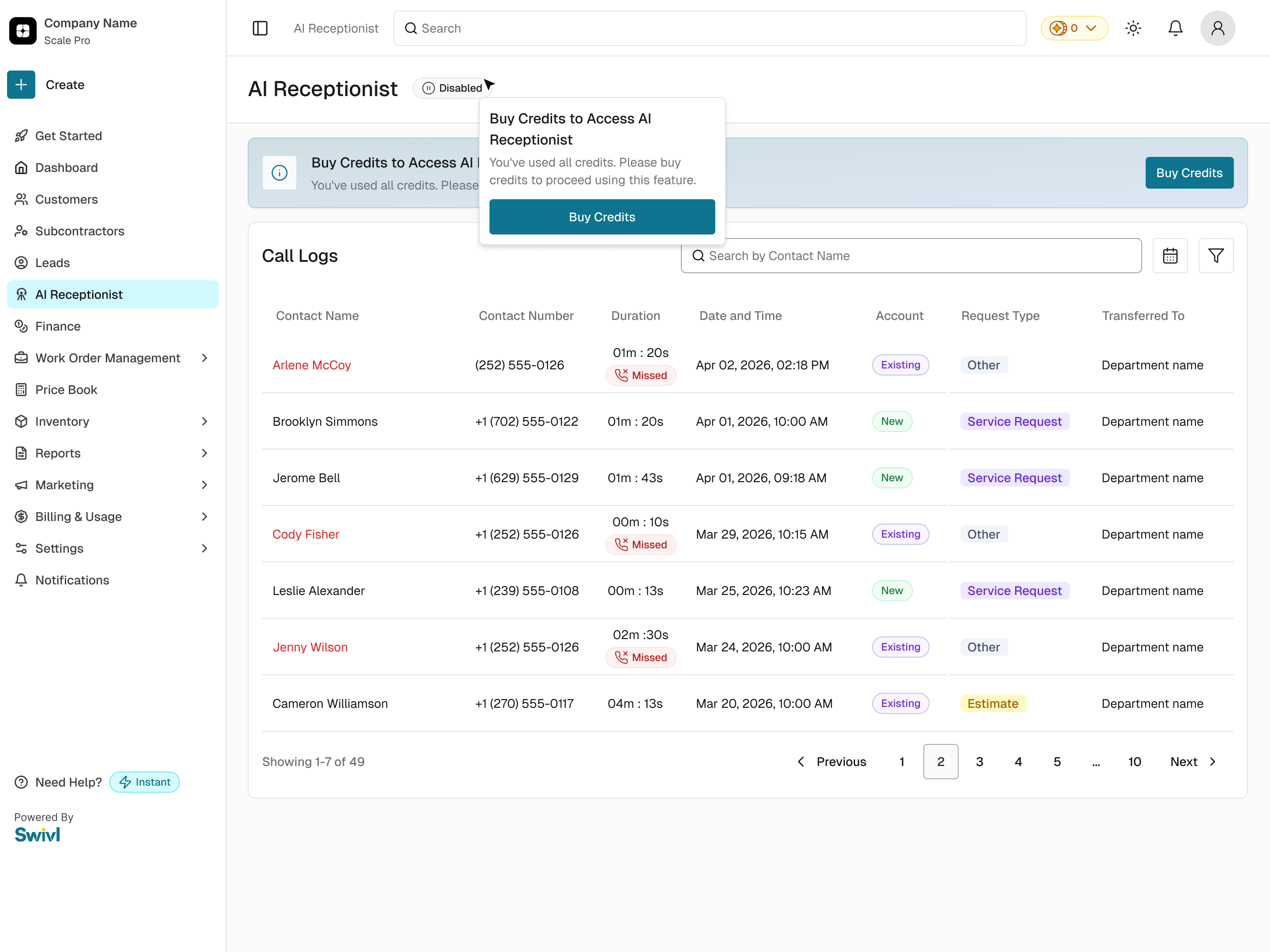
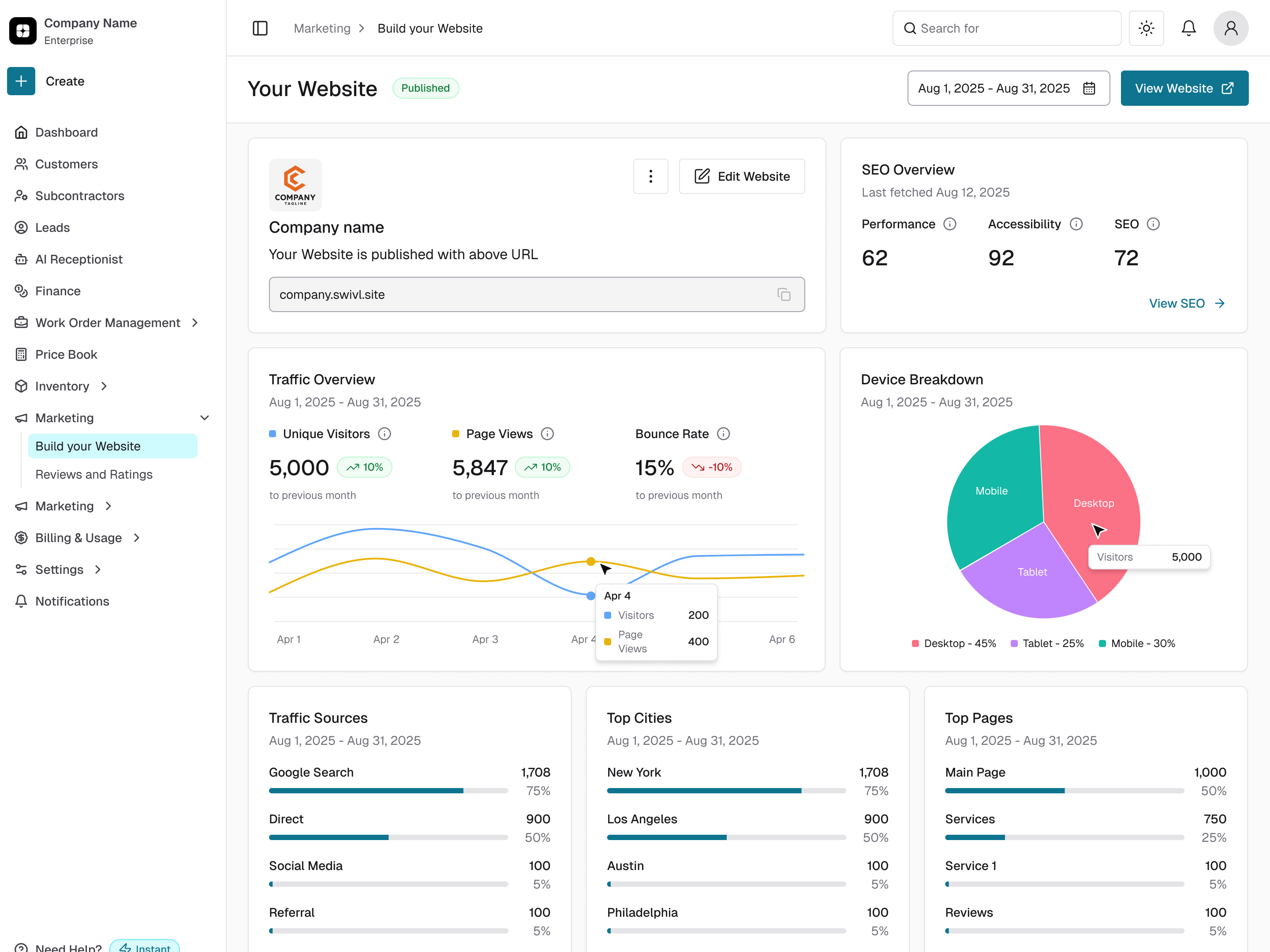
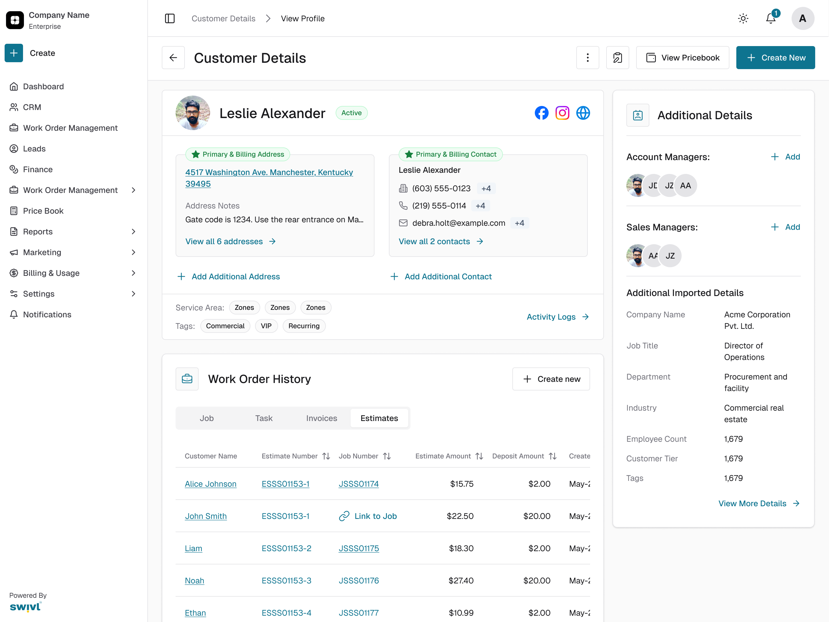
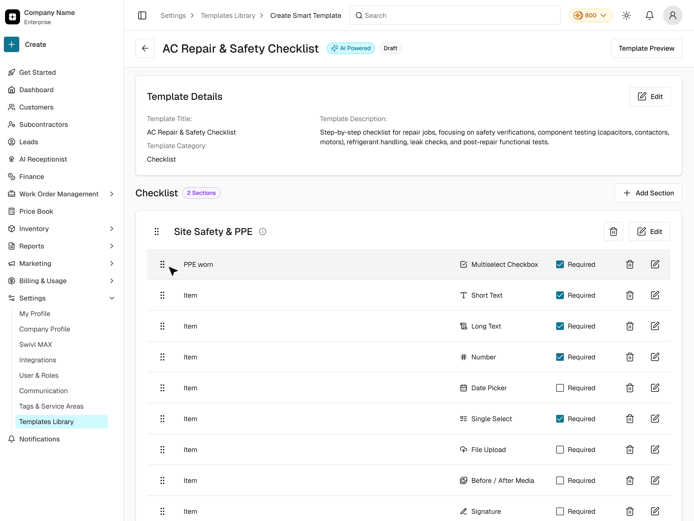
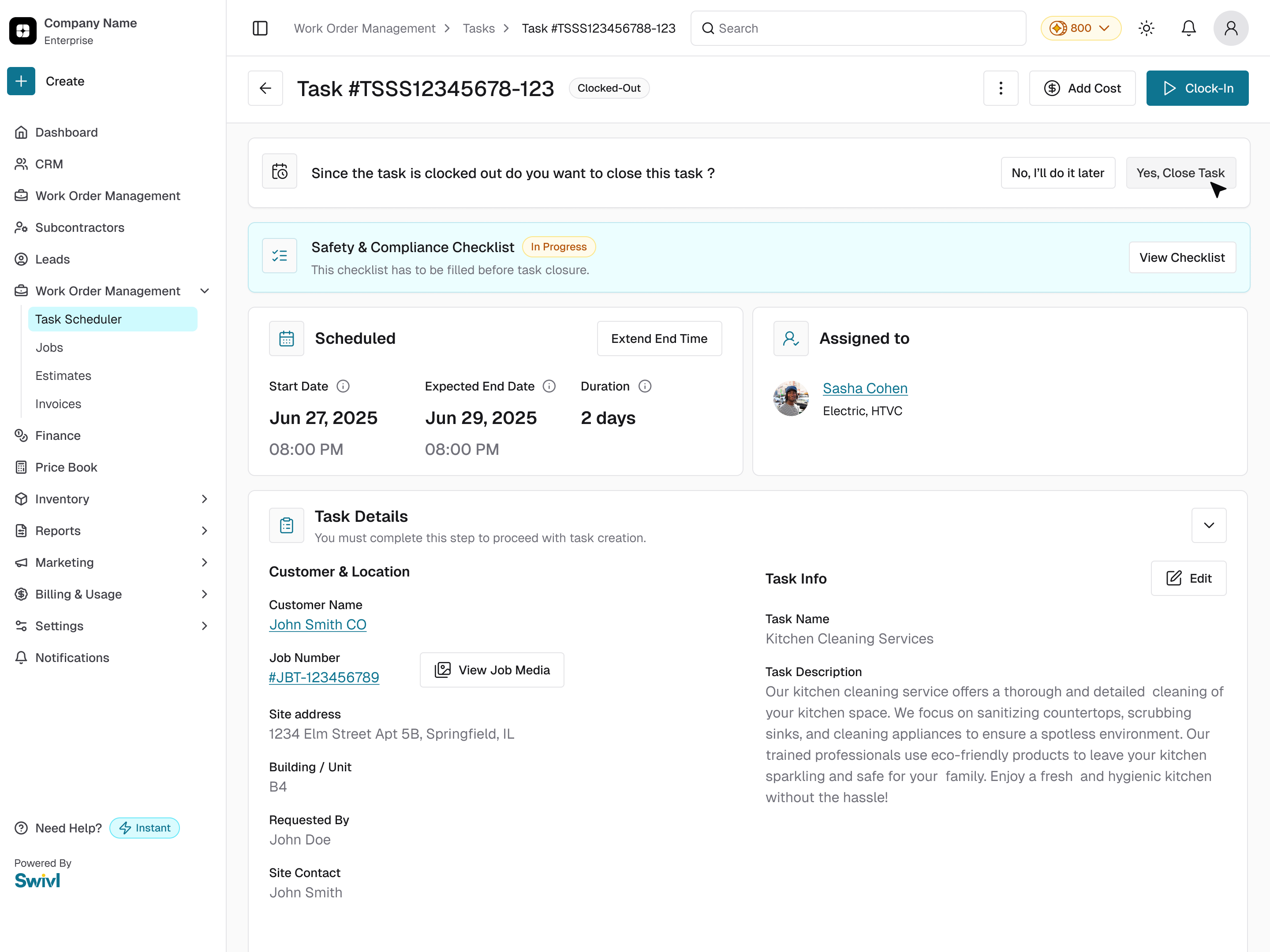
This is what it all adds up to. Five live Swivl screens, built from the same parts. The sidebar, the page header, the cards, the tables and the buttons come straight from the library, so a new screen looks like it belongs on day one.
Five live Swivl screens, all built from the same parts. The sidebar, the page header, the cards, the tables and the buttons come straight from the library, so a new screen looks like it belongs from day one.
V26Final screensNew5 screens · 1.6 s each · loops
AI Receptionist · Call logs
ShowAI Receptionist · Website builder · Customer details · Smart template · Task: each screen holds for 1.6 s, then the next one fades in. Hover to pause; the small bars jump to a screen.SourceFigma, exported read-only at 2× and cut to 1440×1080 from the top. Names and numbers on the screens are Figma sample data.
Credits
Victoria, Lead Product Designer · Aashish, Product Designer · Abhijeet Patil, Product Designer · with the Swivl engineering team